What’s This?
This page is intended to collect in one place plots displaying the results of Bayesian analyses of vaccine efficacy, performed using the methodology described in this article. The data on which the analyses are based come from on-line sources — journal articles where available, but otherwise FDA briefing documents or even corporate press releases. I update or add plots whenever I become aware of newly-available data.
The code that makes these plots is written in Python, and is available from github.
A typical plot resulting from the analysis looks like this:
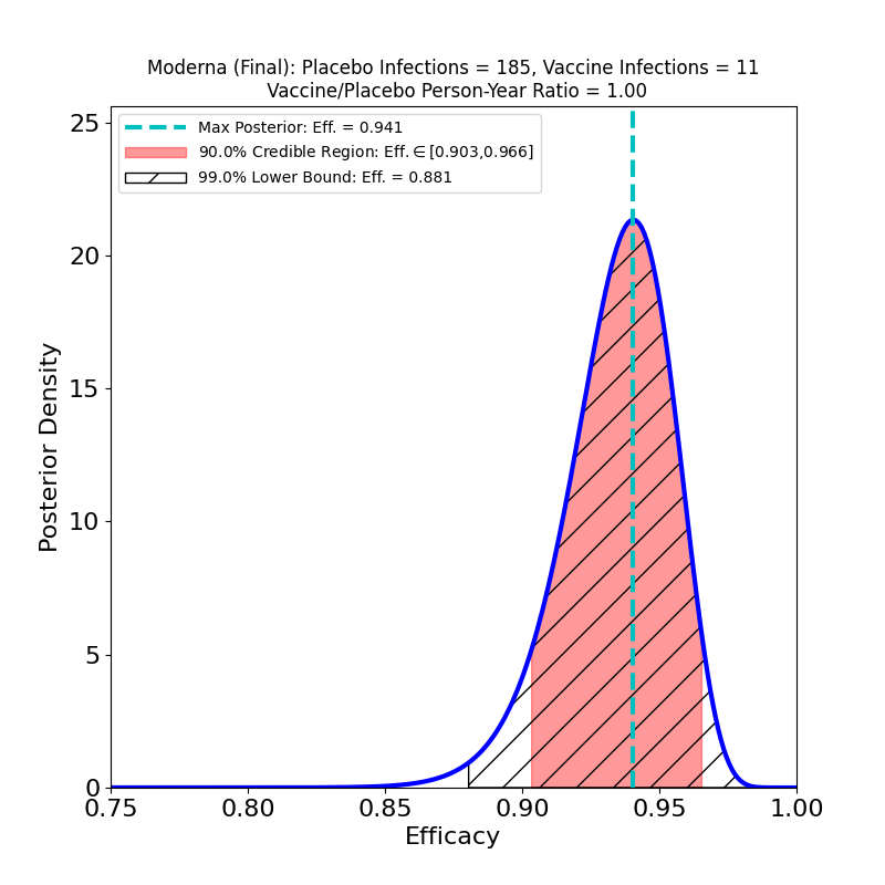
The plot displays the following analysis results:
- A Bayesian posterior density — essentially a representation of how likely any particular value of the vaccine efficacy is — as a blue solid curve.
- The maximum of the posterior density — the most likely value of the efficacy — is shown as a green vertical dashed line, and its value specified in the legend as the “Max. Posterior”.
- A 90% credible region — a region that encloses the true efficacy with 90% probability — is displayed as a pinkish shaded region, and its boundaries are given in the legend as the “90% Credible Region”.
- A 99% lower bound on efficacy is displayed as a hatched region — the lower bound is the left endpoint of the region, while its right endpoint is 1.0 (perfect efficacy). The value of the lower bound is given in the legend as the “99% Lower Bound”.
The plot title also gives the name/sponsor of the vaccine, the number of vaccine-group infections, the number of placebo-group infections, and the ratio of vaccine-to-placebo group person-times-at-risk (usually this is pretty close to the ratio of vaccine-group participants to placebo-group participants). These are the parameters that determine the results of the analysis.
An important thing about this type of visualization is that it allows easy assessment and comparison not only of vaccine efficacies, but also of the uncertainties that attend the efficacy estimates: If a posterior density curve is very broad, then the efficacy of the corresponding vaccine is known with less certainty than is that of another vaccine with a much narrower curve. The uncertainty can thus be understood at a glance. This uncertainty is a factor that is very rarely captured in media accounts of clinical trial results, but is really necessary to a realistic comparison of vaccine performance — one vaccine’s ‘”90%” efficacy may be less meaningful than another’s “90%”.
With very little practice, one can learn to read and interpret such plots, which in my opinion give highly intuitive representations of the constraints placed on efficacy by clinical trial data. Typically, more numerous participants and higher infection rates lead to more concentrated posterior densities — that is, to better-constrained, less uncertain inferences of efficacy value.
Each vaccine is typically associated with several analyses, corresponding to different clinical trial subgroups. For example, trial subjects who develop “severe” symptoms are often singled out, to ascertain a vaccine’s specific efficacy against severe COVID-19 (for the definition of “severe” one would typically have to carefully read the corresponding journal article, or its “supplementary materials” section).
Comments and corrections are welcome. I’m Carlo Graziani, a computational scientist at Argonne National Laboratory. My lab page is here.