What’s This?
This page is intended to collect in one place plots displaying the results of Bayesian analyses of vaccine efficacy, performed using the methodology described in this article. The data on which the analyses are based come from on-line sources — journal articles where available, but otherwise FDA briefing documents or even corporate press releases. I update or add plots whenever I become aware of newly-available data.
The code that makes these plots is written in Python, and is available from github.
A typical plot resulting from the analysis looks like this:
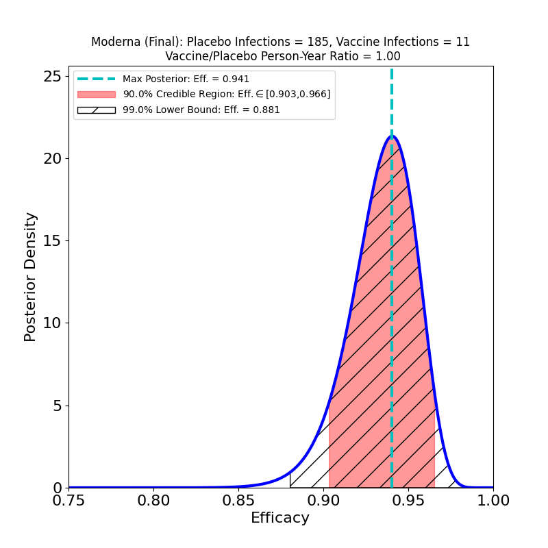
The plot displays the following analysis results:
- A Bayesian posterior density — essentially a representation of how likely any particular value of the vaccine efficacy is — as a blue solid curve.
- The maximum of the posterior density — the most likely value of the efficacy — is shown as a green vertical dashed line, and its value specified in the legend as the “Max. Posterior”.
- A 90% credible region — a region that encloses the true efficacy with 90% probability — is displayed as a pinkish shaded region, and its boundaries are given in the legend as the “90% Credible Region”.
- A 99% lower bound on efficacy is displayed as a hatched region — the lower bound is the left endpoint of the region, while its right endpoint is 1.0 (perfect efficacy). The value of the lower bound is given in the legend as the “99% Lower Bound”.
The plot title also gives the name/sponsor of the vaccine, the number of vaccine-group infections, the number of placebo-group infections, and the ratio of vaccine-to-placebo group person-times-at-risk (usually this is pretty close to the ratio of vaccine-group participants to placebo-group participants). These are the parameters that determine the results of the analysis.
An important thing about this type of visualization is that it allows easy assessment and comparison not only of vaccine efficacies, but also of the uncertainties that attend the efficacy estimates: If a posterior density curve is very broad, then the efficacy of the corresponding vaccine is known with less certainty than is that of another vaccine with a much narrower curve. The uncertainty can thus be understood at a glance. This uncertainty is a factor that is very rarely captured in media accounts of clinical trial results, but is really necessary to a realistic comparison of vaccine performance — one vaccine’s ‘”90%” efficacy may be less meaningful than another’s “90%”.
With very little practice, one can learn to read and interpret such plots, which in my opinion give highly intuitive representations of the constraints placed on efficacy by clinical trial data. Typically, more numerous participants and higher infection rates lead to more concentrated posterior densities — that is, to better-constrained, less uncertain inferences of efficacy value.
Each vaccine is typically associated with several analyses, corresponding to different clinical trial subgroups. For example, trial subjects who develop “severe” symptoms are often singled out, to ascertain a vaccine’s specific efficacy against severe COVID-19 (for the definition of “severe” one would typically have to carefully read the corresponding journal article, or its “supplementary materials” section).
Comments and corrections are welcome. I’m Carlo Graziani, a computational scientist at Argonne National Laboratory. My lab page is here.
Excellent analysis Carlo! And it is really bad, even if somehow understandable in view of the high stakes that have been put on vaccine campaigns worldwide, that these results do not draw enough focus (yet) from the media. The graphs are very intuitive, so I hope to see them soon again on several publications. I have in any case spread the study among my own acquaintacies worldwide. Take care my friend! Andrea
I noted that 90% credible interval was used instead in computing VE shown in the plots of Covid 19 vaccines. All the published studies however used 95% which is required by health regulatory agencies.
I find it misleading and you ought to correct the computation.
Hello.
In my view,you misunderstand the purpose and design of a credible region. It doesn’t really matter what the nominal probability content is,so long as it is stated explicitly. The that”popular” 95% value that you cite (actually closer to 95.5%) comes from the normal distribution, much-beloved but not particularly useful or informative in the present context.
It is also worth noting that “published studies” overwhelmingly give frequentist confidence intervals rather than the Bayesian credible intervals furnished at this page. The conceptual differences between these two types of interval estimates are sufficiently great to make any comparison of results qualitative at best. Standardizing probability contents of the intervals, when those probability contents have utterly different meanings, is pretty pointless.
Thanks for writing.
Let’s use the CDC Advisory Committee on Immunization Practices’ (ACIP) recommendation for our discussion.
95% CI is stated clearly in “GRADE guidelines 6. Rating the quality of evidenced -imprecision” that provides the optimal primary approach to decisions regarding imprecision. GRADE(Grading of Recommendations, Assessment, Development and Evaluation) uses evidence-based approach for developing evidence-based vaccine recommendations.
https://www.jclinepi.com/article/S0895-4356(11)00206-X/fulltext
We should use 95% confidence level as an universal criterion for evaluating the certainty of evidence concerning vaccine efficacy, that is whether the CI (confidence or credible interval) around the true efficacy is sufficiently narrow. Surely 90% CI is wider than 95% CI. Your response however did not address this issue explicitly.
Hi Lam.
Your comment Is a provocation, although in a good way.
In the first place I need to reiterate that Bayesian credible regions and frequentist confidence regions are conceptually incompatible, Please consult any quality statistics text to understand the philosophical differences between the two objects. They cannot be assimilated rhetorically, as you do (“confidence or credible region”). This is simply not a proper scientific way to proceed. The differences between them are such that making their contents numerically the same would standardize nothing.
Furthermore, the paper that you cite discussed frequentist confidence intervals exclusively. This is unsurprising, as medical science is still very much oriented towards frequentist methods. It may surprise you to discover that much of science outside of medicine has moved on from frequentism, because of the many limitations inherent in those methods.
The Bayes vs. Frequentism debate in statistics is now ancient and a bit tired, and not resolvable as a scientific matter because it is a matter of epistemological preferences. I will simply state my own prejudices: the medical community’s statistical practices are largely obsolete, and remain the way the are now because most medical professionals never learn modern statistics. The paper that you cite represents an absolutely perfect example: enormous effort expended on what should be an absolutely trivial question, and would be, if frequentist confidence intervals were not such problematic constructions.
However I would certainly not expect most medical statisticians to agree with me on this. So it’s just a contrarian blogger’s view.
Again, thanks for writing.
I categorically object 90% credible interval which was used to construct the graphs you plotted. It is not the issue about Bayesian vs Frequentist which you highlighted in the previous post.
Please read the paper “Safety and Efficacy of the BNT162b2 mRNA Covid-19 Vaccine” and note that Table 2 (Vaccine Efficacy against Covid-19 at Least 7 days after the Second Dose) shows 95% Credible Interval. This means that the null hypothesis is appropriately rejected if the probability of a Type I error is <5%. In this light, all your Bayesian graphs for Covid-19 vaccines are indeed irrelevant.
https://www.nejm.org/doi/full/10.1056/nejmoa2034577